Design Leader

Building experiences people tune into.

Fifteen-plus years leading product design across broadcast, streaming, and now e-commerce — currently Senior Design Manager at Wayfair. This is a survey of three projects where the work moved a network, not just a screen.

Currently
Senior Design Manager, Wayfair
Previously
Design Lead, UX — TD Bank (DCX)
Before that
Experience Design Manager, Rogers Sports & Media
Brands led
Sportsnet · Citytv · CityNews · BT · Chatelaine

01 / CH-680

CityNews / 680News: unifying a national news network

Two separate brands — TV news and news radio — ran on dated, disconnected sites. The mandate: combine them into a single, modular platform that could scale across every Rogers news market in Canada.

Role
Design lead
Team
Cross-functional — design, editorial, engineering
Scope
Web + app, national rollout
Platforms
Mobile-first responsive web
CityNews responsive site shown on a laptop and two phones with live radio player docked
One platform, every screen — responsive web with a persistent live audio player
CityNews modular page architecture wireframes showing header, top section, body modules and footer
Modular page architecture — unlimited body modules editors can rearrange
CityNews homepage hero module with lead story, secondary stories, weather and traffic card
Homepage hero module — lead story with weather, traffic and secondary rails
CityNews Top Stories module with four story cards and timestamps
Top Stories module — four-up card rail with recency stamps
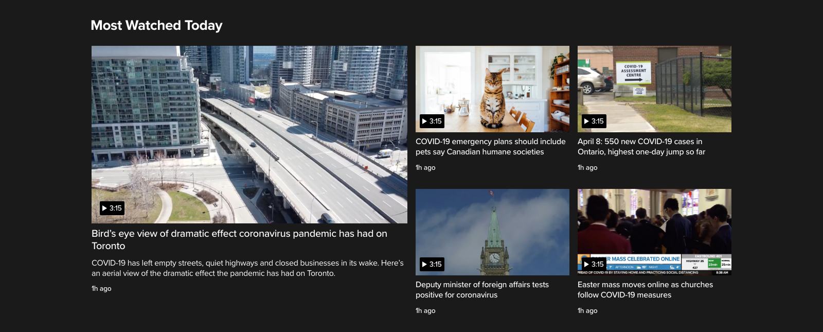
CityNews Most Watched Today dark video module with a featured aerial video and four secondary video cards
Most Watched Today — dark video module for higher contrast playback

The business problem

CityNews and 680News shared most of their content but ran on separate, aging technology. Publishing took too long, the mobile experience lagged behind where roughly 80% of traffic actually came from, and every market update meant touching two disconnected systems instead of one.

Key decisions

  1. 01

    Mobile-first, not mobile-adapted

    With the majority of users already on mobile, the core experience was designed there first and scaled up to desktop, not the reverse.

  2. 02

    Atomic, modular design system

    The page was broken into reusable cards and modules instead of fixed templates, so editors could rearrange content without a dev ticket.

  3. 03

    Keep functionality, simplify structure

    Research into App Store reviews showed 61% of negative sentiment was about performance (crashes, freezes) and only 3% about missing features, so the strategy was to stabilize and simplify, not add.

CityNews digital style guide pages covering colour usage, typography, grid layouts, spacing, modules and buttons
Digital style guide — colour, type, grid, spacing, modules and controls
High-fidelity CityNews mockups for home, search and video templates at desktop and mobile widths
High-fidelity templates — home, search and video at desktop and mobile

Leadership moment

Aligning two brand teams — TV and radio — around one shared information architecture required getting editorial, marketing, and engineering stakeholders from both sides to agree on a single navigation model and visual language, without either brand feeling like it had been absorbed by the other.

Add a specific story here: a moment you resolved disagreement between the two brand teams, or how you structured the working group.

Validating the approach

Ran unmoderated usability testing with 15 participants against the System Usability Scale (SUS) on the core journeys — homepage, article, video — before committing to full production.

Outcome

2

brands unified into one platform

80%

of traffic already mobile — validated the mobile-first bet

61%

of negative reviews traced to performance, not features — reframed the roadmap

Add post-launch metrics if available: engagement lift, publishing time saved, or national rollout scale.

02 / CH-CTV

Citytv: rebuilding trust, one star at a time

The Citytv app — home to some of Canada's most-watched shows — had a 1.5-star rating, low engagement, and a growing list of technical complaints. The goal: redesign the iOS and Android apps around what viewers actually do — catch up on shows — and rebuild the app's credibility from the ground up.

Role
Design lead
Team
Product design + engineering, iOS & Android
Scope
Full app redesign
Result
Apple “Best New Apps” feature, 2018
Citytv app shown across iPhone and iPad screens including video player, show grid and notification settings
One experience across every screen — phone, tablet and TV

The business problem

App store reviews were as low as they'd ever been. Users loved the shows but weren't engaging with the app itself — no AirPlay support, heavy ad load during playback, and reliability issues (crashes, freezing) were driving people away from a product built on genuinely strong content.

Key decisions

  1. 01

    Personalize the home screen

    Instead of a static default carousel, the home screen surfaced shows based on individual watch behavior.

  2. 02

    Design for “catching up,” not just watching

    A “Continue Playing” rail and a “My List” feature were built around the core user journey of returning to finish something.

  3. 03

    One experience across every screen

    An omnichannel approach let a viewer pause on their phone and resume on Apple TV.

Process

The redesign started with research and discovery — market research, analytics review, app store sentiment, user surveys, and guerrilla testing — before a single wireframe was drawn.

Citytv app user flow diagram from launch and sign-in through home, schedule, watch list and video player
User flow — sign-in optional, every path leads back to playback
Hand-drawn wireframe explorations of four Citytv home screen layouts labelled A through D
Home screen explorations — four layouts tested before committing
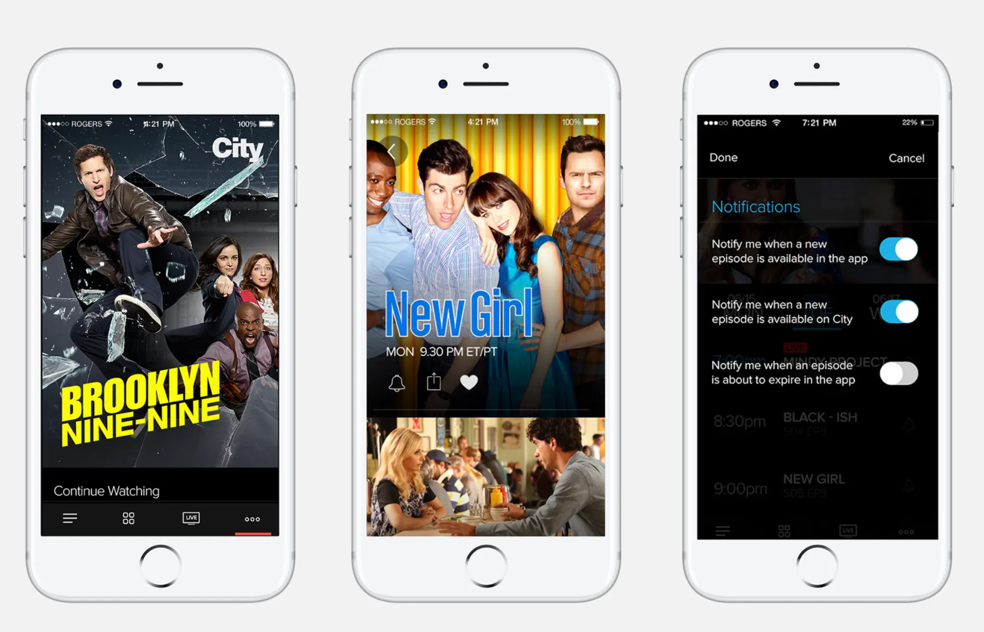
Three Citytv app screens: Brooklyn Nine-Nine continue watching, New Girl show page, notification settings
Final app — continue watching, show page, and granular notification controls
Citytv show artwork tiles for The Odd Couple, The Last Man on Earth, New Girl and The Middle
Show tiles — artwork-led browsing built around the network's biggest titles
Citytv show artwork tiles for Scream Queens, Scorpion, Scandal and The Real O'Neals
Consistent tile system across genres and seasons

Leadership moment

Add a specific story: how you got engineering and brand stakeholders behind cutting scope to focus on stability first, or how you ran the guerrilla testing sessions and turned findings into a defensible roadmap.

Outcome

+25%

iOS usage increase

+14%

Android usage increase

4.5★

App Store rating, up from 1.5★

The app was featured in Apple's Best New Apps category in 2018, and the rebuild became a recognized turnaround story internally for what a research-led redesign could do for a struggling product.

03 / CH-SNW

Sportsnet Now: one product, every screen

Sportsnet Now, a 24/7 live-sports subscription product, existed as several independent apps — web, mobile, and TV/connected devices — each built and updated on its own. The mandate: replatform into one consistent, personalized product that could support next-gen features like stats overlays and interactive timelines.

Role
Design lead
Team
Design + platform engineering across web, mobile, TV
Scope
Full replatform — web, mobile, connected TV
Model
Subscription streaming
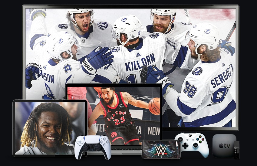
Sportsnet Now running across a TV, tablet, laptop, phone, game consoles and Apple TV
One subscription product across TV, tablet, laptop, phone and consoles
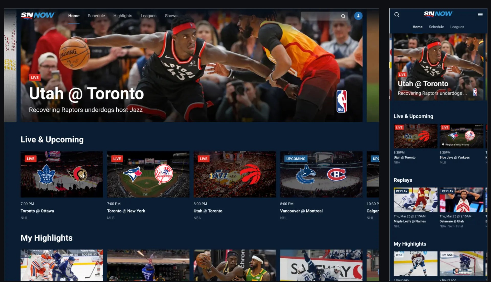
Sportsnet Now web and mobile mockups showing a live NBA hero, Live and Upcoming rail, replays and My Highlights
Actual mockups — one system across web and mobile

The business problem

Every platform — web, mobile app, TV app — was independent: any update meant separate code and a separate release. Content was static, with no way to merchandise based on user preferences or time of day.

Key decisions

  1. 01

    Design a system, not screens

    Started with site architecture and a shared design system so future features would launch consistently everywhere by default.

  2. 02

    Digital-first, not linear-mirrored

    Designed around live sporting events digitally instead of continuing to mirror linear TV.

  3. 03

    Prototype and test the highest-risk feature early

    Interactive timeline markers (letting fans jump to key moments in a live game) were concept-tested with users before being built, surfacing a discoverability issue while still cheap to fix.

Sportsnet Now site map showing signed-out global navigation and page structures for home, schedule, highlights, leagues, shows, team and player pages
Architecture first — shared site map across web, mobile and TV

Leadership moment

Getting three previously independent platform teams (web, mobile, TV/connected devices) to adopt one shared design system required aligning engineering leads across teams that had never had to coordinate releases before.

Add a specific story: how you sequenced buy-in across the three platform teams, or a moment you had to make a tradeoff call between platform parity and platform-specific constraints.

Outcome

3

independent platforms unified into one system

1

shared design system replacing 3 disconnected codebases

Usability testing on the interactive timeline feature found a strongly positive reaction overall — participants said they'd use it and were excited to see it live — with one clear, fixable issue: low discoverability of the timeline icon itself.

Sportsnet Now connected TV screen showing interactive timeline markers for goals and penalties over a live hockey broadcast
Interactive timeline markers on a live game

Add post-replatform metrics if available: subscriber retention, cross-platform engagement, or release velocity improvement.

About — Off Air

I'm a design leader who's spent the last 15+ years turning fragmented, underperforming digital products into experiences people actually want to use — across broadcast news, live sports streaming, entertainment, and now e-commerce.

My background is in media: I led design for some of Canada's biggest news, sports, and entertainment brands at Rogers, then moved into financial services at TD before joining Wayfair as a Senior Design Manager. Across every stop, the throughline has been the same — take a fragmented, technically constrained product, understand why users are actually struggling, and rebuild it as a coherent system a team can keep improving after I've moved on.

I'm currently exploring Senior Design Manager and Director-level opportunities where I can bring that same systems-and-people approach to a new team.

  1. 2023–Present

    Senior Design Manager, Wayfair

  2. 2022–2023

    Design Lead, UX Design — Digital Customer Experience, TD Bank Group

  3. 2018–2022

    Experience Design Manager, Rogers Sports & Media

  4. 2011–2018

    Senior Product Designer, Rogers Sports & Media

  5. 2007–2011

    Managing Web Producer, Rogers Sports & Media